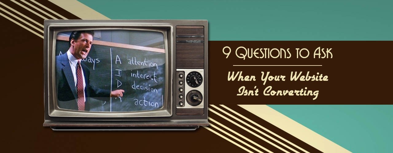
As much as we would all like to believe it, pay-per-click advertising is not a magical formula — it is advertising. Even though we can determine ideal keyword targets and optimize your web traffic over time, there is still the important aspect of your site and if it turns users into customers,.
If you’re wondering why on Earth your advertising isn’t bringing in business, even though it’s bringing in relevant traffic — it’s time to take a hard look at your site’s conversion funnel with these 9 questions.
1. Do my users know they have reached the right place?
When someone first types in a search query and clicks on your ad, where will they land? Choosing the perfect landing page is a huge part of where your PPC management or SEO company should be focusing their efforts — however, the contents of your landing page are up to you.
Keep in the mind that the user is probably scanning the page, not necessarily reading every word. So include relevant keywords to clue them in that they have reached the exact page they are looking for. Also, make sure to include a balanced mix of photos and content, so the page looks clean, well-designed, and welcoming.
2. Can users easily navigate around my site?
I don’t know about you, but I’m not about to give my credit card information to a faceless company. I want to know who I’m working with and learn more about what they offer before I check out.
Even though you may be leading users directly to the page they are looking for — i.e., a specific product page for a particular item — you have to assume that they may want to explore your site before they commit to becoming a customer. This could be beneficial if you make it easy for them to add other products to their cart.
To earn repeat business and improve user experience, make it easy and intuitive for users to get around on your site. Include standard and well-organized navigation on every page with categories that make sense. If you have a lot of products, organize them into subcategories for easier navigation.
3. Can users easily find what they’re looking for on the page?
When a user lands on the page they are looking for, whatever you’re selling should be the primary focus on the page. If you are selling a product, this would look like a product photo and title, with relevant information and an accessible link to add it to the shopping cart. If you are selling a service, this might look like photos of your work and any information they would need about what your work and the details of what your services include.
Think like a consumer. Wouldn’t you want to know what you are paying for? A lot of this has to do with layout and design, as well as how you present the relevant information. And it’s also your chance to include any mention of special offers or quality statements that make you stand out.
4. Do users have a clear visual of what they will be purchasing?
This question focuses a little more on the visual aspect of your presentation. We’re living in a visual era, where photos are an important part of how we absorb information. If you don’t have a clear, detailed photo of a product you are selling, how will the buyer know that it is good quality?
If you don’t provide a clear enough visual for your buyer, you probably won’t gain their trust. And in most industries, there are enough other options that they’ll probably just move on to the next website — it’s only a few clicks away.
5. Is industry research or background information readily available?
Why are you the expert and why should they trust you? Presumably, because you really know what you’re talking about. If you can offer some valuable information about a product, service, or industry that the user has already shown interest in, they will likely turn to you when they do end up buying (or when they want to buy more).
While it’s important to offer access to this information and present it on your site, it is just as important not to crowd out the information that is most immediate and important to the sale. Include a link on the page or in the menu, but don’t flood your landing page with general copy.
6. Do you have a clear call-to-action on every page?
Including a call-to-action (CTA) is basically advertising 101, but we still see a lot of small businesses who are afraid to be bold with their CTAs. Yes, you are providing information and clearly selling something, and most people can figure out how to get your product without a CTA — if they really want it. But to a user who is staring at a screen full of all this information, CTAs offer much-needed direction and a clear path to conversion.
Hint: we especially love CTAs when paired with a limited-time offer or discount! Nothing wrong with creating a little bit of urgency.
7. Do users know what to do if they have questions or need support?
You know those pop-up chat windows you often see on websites for larger corporations or retailers? They might seem annoying until you really do have a question. Then, you’ll likely be thankful that great support is at your fingertips.
We’re not suggesting that you need to adopt this specific strategy on your site, but you do need to have some sort of option — preferably a phone line or email — for customer support. This is really just another opportunity for you to show off your smarts and high level of commitment to providing the best customer experience, and will ultimately help you capture that sale.
8. Do you have a process for interacting with users before and after the sale?
If you have a long sales cycle, you don’t have to wait until that final point of sale before you start your sales process. And if you have already sold to a user, don’t leave it at that — start the relationship now.
Don’t be afraid to include a CTA on your site to invite users to provide their email address to receive special offers and news. Most people don’t mind receiving some email correspondence from brands or companies they trust, as long as it doesn’t come too often and the offers and information stay relevant. Invite users to follow you on Twitter, Facebook, or LinkedIn so you can continue to share your content with them and even have a public conversation.
9. How will you create loyalty and advocacy?
The idea of “optimizing your sales funnel”—one we often hear repeated in marketing — is all about improving your formula for customer creation. What brings people back? How can you get referral business from those who trust you?
In our business, clients who see the best results are those who put in the work to ensure they have loyal clients. Whether they provide over-the-moon customer service, are the most knowledgeable in their industry, have a great referral program, spend a lot of time building their brand — or most likely, all of these — they often focus on getting the most out of the business they are bringing in. This ultimately leads to a better ROI and a more sustainable business.
Not surprisingly, these business owners are often the most passionate about their jobs. Your business thrives if you do — it’s a win-win! Not sure how to go about these changes or worried your site needs an overhaul? Get in touch with your Account Manager or our web team for help!


