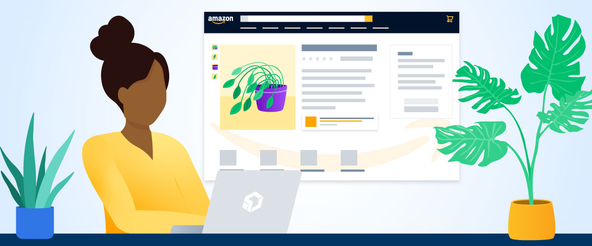
On an Amazon product listing page, branded content used to be limited to product images and descriptions. However, today registered brands can expand their presence visually ‘below the fold’ with Amazon A+ Content. Using images, text, and design it is now possible to differentiate yourself and show your true colors with A+ Content. If you’re not using A+ Content to showcase your brand ethos, address potential concerns, or educate customers about product features in a visually compelling way, you’re missing out on the opportunity to elevate the shopping experience of your product listing page.
According to Amazon, implementing A+ Content can increase sales by 3-10% on average.

In a product-driven shopping environment like Amazon, your product detail pages often serve as the first branded touchpoint for potential customers. That’s why it’s important to capitalize on every design opportunity to emphasize the quality of your product and the personality of your brand.
DIY Friendly
The A+ Content Manager is easily accessible from the advertising tab on your Seller Central or Vendor Central home page. At no extra cost, brand-registered advertisers can fill the A+ Content section of the product listing page with engaging content that encourages users to take a closer look and get to know your brand and product line as they scroll.
Try to create a balance between text and imagery using:
Text Fields
Text fields are the best way to communicate detailed, long-form information because they dynamically prioritize optimal visibility on both desktop and mobile.

Design by Samuel Sloper, Project Management by Bree Reetz
✅Do: Use text fields for detailed explanations to help customers become experts on your product or brand. When possible, find ways to insert keywords that will help people find your listings through search engine optimization.
❌Don’t: Write up a wall of on-page text that could intimidate a casual user and thus be skipped entirely.
Banner Design
Use banners to integrate high-quality images that highlight product features or show your product in use with relevant, branded designs.

Design by Samuel Sloper, Project Management by Taylor Everett
✅Do: Show your product in use so that it resonates with your consumer’s lifestyle. You can even use graphic overlays to provide additional clarity on how a specific product or feature functions.
❌Don’t: Embed too much small copy on your banner designs. Images appear smaller on mobile devices and so small text can quickly become illegible.
Comparison Chart Tables
Highlight features across your product line using a comparison chart. This module style is the only one that supports cross-product clickability, so it’s worth considering adding to the mix.

Design by Dani Figueroa, Project Management by Bree Reetz
✅Do: Cross-sell your products by giving users the ability to easily compare the price and differentiating factors of your product offerings before they turn to a competitor.
❌Don’t: Write off using the comparison chart just because you don’t have comparable features across products. Try thinking of other creative ways to take advantage of this module style!
And More!
There are many combinations of image and text fields available for A+ Content design. Too busy to do it yourself? Overwhelmed trying to determine a strategic approach? Let our Creative team do it for you!
Tips for creating effective Amazon A+ Content:
- Populate all available sections with modules to maximize the allotted space.
You may have access to 5-7 sections of content depending on whether you are a Seller or a Vendor, and whether you qualify for access to Premium A+ Content or not. If you don’t know where to start, our Creative team would love to help you figure out the best strategy to utilize the space you have to achieve your goals. - Be aware of Amazon’s evolving standards for A+ Content.
Don’t reference shipping, warranties, guarantees, customer service, websites, contact information, or customer reviews in your content. If your content doesn’t comply with Amazon’s standards, your content will get disapproved. Our Creative team is up-to-date on the latest standards and strives to create content that complies with Amazon’s policies. When you’re working with us, even if something does get flagged unexpectedly during the approval process, our team will work to modify the content until it is approved whenever possible. - Design for both desktop and mobile viewing
Be aware that Premium A+ Content and Basic A+ Content handle mobile optimization differently. Premium A+ Content allows you to design and upload a different version of each banner specifically for mobile viewing. While Basic A+ Content, banners are dynamically resized for mobile viewing. This means that if the text is too small in a banner design, it may become impossible to read on mobile devices. Our professional Graphic Designers use industry best practices to create visual emphasis where it counts. We also add concise on-page copy in meaningful ways to provide the opportunity for engaged users to dive deeper. This creates an effective balance of content that works well for users viewing on mobile or on desktop. - Address purchasing barriers and questions
The most effective A+ Content design is more than just a pretty display; it actively works to build trust by educating the consumer about your products and your brand. Consider using negative reviews to extract information about purchasing barriers and address them in your A+ Content by providing context and explanations. Are there questions that come up about your product? Dedicate space in your A+ Content to answering those questions upfront. Here at Logical Position, we strategically review the feedback you’re getting and tailor the content we create to speak to your audience.

Don’t miss an opportunity to outfit your product pages with effective Amazon A+ Content!
If you don’t know where to start or you just don’t have time to juggle one more thing, learn more about how our creative team can develop a professional design approach with a custom strategy that meets your needs. We’d love to help you create effective Amazon A+ Content for your brand – get in touch!


