“The farmer killed the goose to get at all the golden eggs, but he ended up destroying the golden egg business altogether.”
There’s a lesson in that fable for anyone who could benefit from better landing pages and more effective conversion optimization:
Sales aren’t produced by an isolated component of the landing page. Conversions come when visitors enter your sales process, then follow the path you’ve prepared.
Let’s look at seven critical components of highly effective landing pages and how they fit in the journey a prospect takes in order to buy from you.
None of these factors contain the secret to success. All of them working in concert, however, can give birth to gold.
Get Optimized
Advertising with Google can require a considerable investment. According to the Keyword Planner tool, for instance, the search term “New York City dentist” draws an average of 140 searches each month. The suggested AdWords bid to get your ad shown in search results for that keyword phrase is $18.82.
That means, you’re probably going to need to pay more than $18 for every click your ad generates. Eighteen bucks. If your ad gets clicked 100 times in a month, your AdWords tab is going to be almost $1,900.
Wouldn’t you think the page each of those clicks resolves to should be optimized to accomplish the results you seek?
Here are the current AdWords bidding winners (see the screenshot) for a search on “New York City dentist.” Checking the first four placements, none of them redirects to a special page at all.
They simply take the visitor to the homepage for the business, and that could be costing those dental practices a wad of cash.
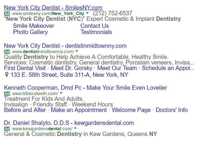
The top bidder seems to have a landing page (www.smilesny.com/New_York_City). Hovering over the link, though, you can see it actually points to the homepage.
Why do you need a landing page at all?
For the purposes of this discussion, let’s agree that home pages are typically meet and greet spots. They help visitors find the information they seek.
Homepages are smiling, graceful hosts. They can contain multiple calls to action and multiple links. They are, in a word, a “general” introduction to your business.
Landing pages, though, serve a narrow purpose. They’re more like traffic cops. Landing pages direct visitors on a certain path. Landing pages offer one call to action and one link. Landing pages are aimed at converting interest into a lead or a sale.
7 Habits to Consider in the Design of Your Landing Pages
The principles listed below are fundamental to landing page development. Just like the goose and the golden eggs, though, they aren’t stand-alone principles.
Effective landing pages will incorporate all the essentials. They will also occupy a definite strategic position in the customer journey from discovery and interest to education and purchase.
- Your landing page must have a clear goal. “Begin with the end in mind.” Know what you want to achieve with the page and determine in advance how you will measure your success. Don’t lift a finger to do anything else until you are clear about the results you seek.
Note how Zenefits puts the entire focus of their landing page (see the screenshot) on their #1 goal: they want visitors to use their insurance comparison tool. They include other essential components, but all are there to support their primary call to action.
- Your landing page and the ad that sent the prospect to it must be in absolute agreement. That’s called “keeping your promise,” and nobody likes a promise breaker. If your ad mentions a free mp3 study course, then your landing page should focus on who needs the course, why they need it, and how to get it.
Here’s an example from Google Ads. A search for “free ebooks” shows this ad (see the screenshot) in second place on the search engine results page:
The searcher wants free ebooks, and this website says it’s going to provide a “free digital library.” If you follow the add link, though, here’s a snippet from the landing page you get (see the screenshot). It looks a whole lot more like a plea for donations than a free ebook depository. Mismatches like that tend to harm the brand and don’t build goodwill.

- Your landing page needs focus. A confused visitor is a former visitor.Every page has a primary purpose (our first fundamental). To achieve that goal, landing pages should be super-heroes focused on the one thing you want visitors to think and do. Don’t PLACE distractions on your pages. Look at your work closely and remove every possible distraction you see. Keep it simple. Keep it focused.
Going back to the “New York City dentist” search example, lack of focus is why home pages are almost always a poor choice for your landing page. Note how busy the above-the-fold section of the SmilesNY.com landing page is (see the screenshot).

The visitor can find out more about cosmetic dentistry, periodontics, orthodontics, etc., follow the practice on social media, figure out what the magazines have to do with dentistry A phone number is prominent, but I may not want to “rediscover [my] smile.” Maybe I have a toothache. The best call to action may be the “Request Consultation” button, but it’s certainly not the focus of the page. Effective landing pages aren’t one-stop-shops. They are focused. - Landing page forms should be short and sweet. You probably don’t need to collect more than a name and email address to get started building a relationship. Begin by grilling visitors for everything short of their social security numbers and they’ll balk. Go slowly. Provide a path for your prospects, not a chasm.
Not to pick on the dental site, but a click on the “Request Consultation” button resolves to not just one form, but two. Not only is that a bit confusing, but the instructions and notes push the primary form down past the fold (see the screenshot). And why do I need to enter my time request twice? Never put obstacles in the way of prospects. Make the path to purchasing your products or services as easy as possible. Cut confusion. Less is often better.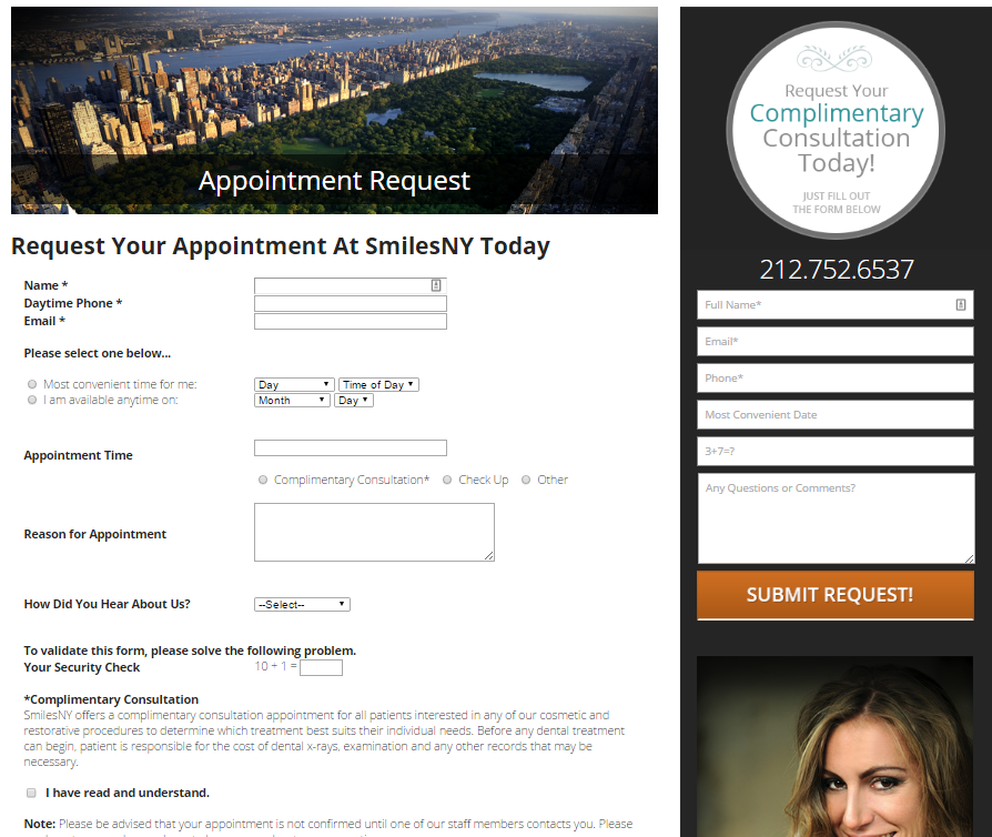
- Landing pages must build trust. Your visitors need to feel they’ve been told the truth and that your company is trustworthy. That takes more than just a badge of authority and a quote or two; trust-building is an all-encompassing job. It factors in the preferences of your primary audience, the voice of your copy, even the colors you choose. If you don’t build trust, you lose sales.
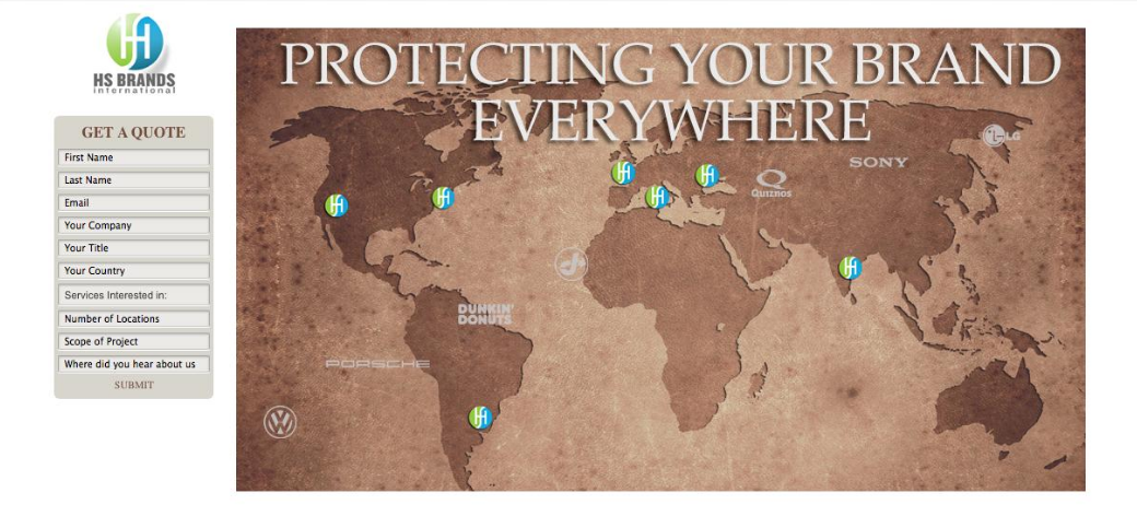
HS Brands manages to pull in a several powerful concepts in this example (see the screenshot). At a glance, the visitor knows they are global (offices across the map), conservative but not stuffy (the colors), and capable (major brand names scattered throughout).
- Landing pages must be mobile-amazing.
 Not mobile-friendly. Not mobile-responsive. Your page should be clear and effective when viewed from any device. That takes more than technical know-how. It’s a factor in your copy, your layout, and the content you display.
Develop a “mobile first” attitude – because chances are high the first visit you get from any given prospect will be via a mobile device.
Here’s another tip: visitors will judge the quality of your business by the quality of your website. This company (see the screenshot) not fails to optimize its mobile presence, but uses “Optimum” in the company name. Your online presence is the first glimpse many prospects will have of your offline abilities.By the way, we used a mobile view testing tool to view the page as it appears on mobile. Check your webpages via mobile regularly. You may be surprised. - Landing pages must address the needs and desires of the visitor. Your landing page is about them, not about you. It’s not a soapbox to brag about your products or your people. The landing page is where those who hope to find a solution to a problem come and (hopefully) get closer to solving that problem. Mobile first. Customer first.
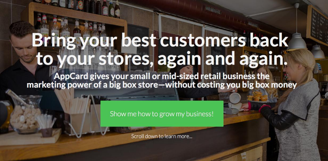
Notice how many times “your” and “you” are used on this AppCard landing page (see the screenshot) versus the mentions for “us” or “ours.” And the copy on the response button uses “me” and “my” as first person for the prospect, not in reference to the company.
Bonus Habit: Always keep testing. Build your page according to the fundamentals, then observe and record the results. Change something. Test again and build again. Build more.
Many companies send traffic to a homepage or product page in situations where a properly designed landing page could boost conversions. Try it and see.
7 Habits of Highly Effective Landing Pages
We’ve looked at the principles of effective landing pages, and we’ve provided examples of pages that exemplify those principles. Before we finish, though, there are a few more points that should be mentioned. Here are some of the things landing pages should NOT have:
- Navigation bars
- Side bars
- Footer bars
- Sliders
- Excessive pop-ups
- Auto-play music
- Auto-play video
- Grammatical errors
Landing pages are tactical tools tasked with a specific job. Used correctly, they can help you get more business quickly. They may look stand-alone, but landing pages are far from that. Your landing pages are an integral part of your marketing strategy and your brand.
Use them wisely.


